
Sunkist Design System
This project involved the most comprehensive redesign of Chegg's design system in over 5 years. Previous to this, there were slightly different styleguides being used across mobile, desktop and email.
In conjunction with the goal of creating a more unified cross device experience, we also wanted to create a system that was better aligned with the brand than the previous version.
For this project I was the UX Lead responsible for driving the intiative and worked with a team of designers across UX and Marketing to collaboratively define the system.
- Responsive Web
- Chegg
- Chegg.com
Kickoff workshop
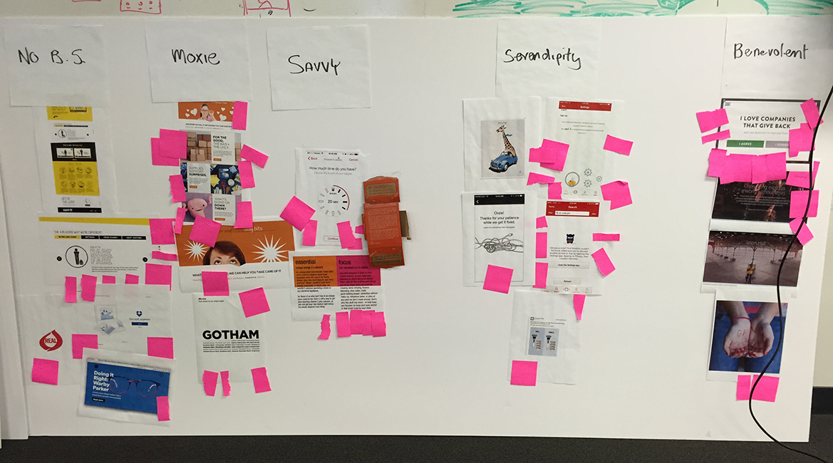
To help better align the new system with the brand we hosted a kickoff workshop with the Marketing and UX teams. One of the activities in this workshop was to visualize Chegg's 5 brand attributes. This helped us better understand the overall brand and how it might apply to the design system.
Style explorations
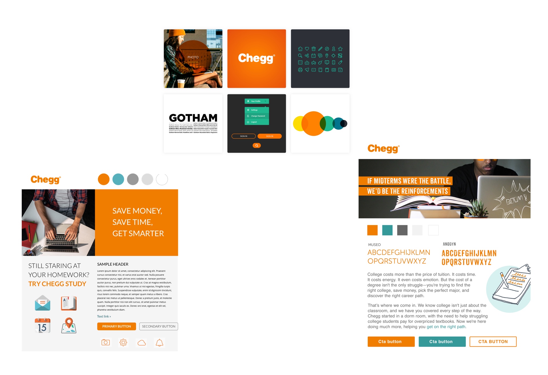
Another exercise we did to help define a visual direction for the design system was to use StyleTiles. These are essentially mini mood boards that combine elements of the system such as colors, photography and typography to create a vision of how the site might feel without designing any actual pages.
Foundational elements
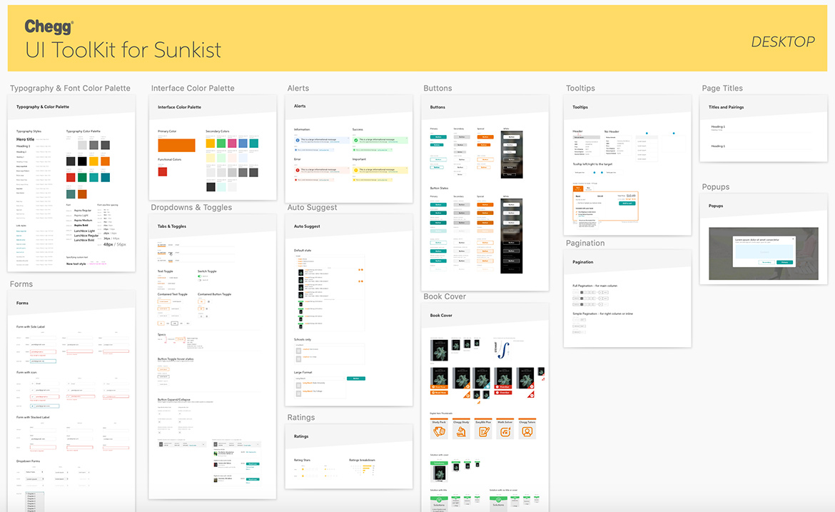
Once we decided on a general style direction we then broke into smaller teams to define the foundational elements such as colors, typography, buttons, etc... These were later combined into a UI Toolkit that was a shared source of truth across the team.
Atomic Design
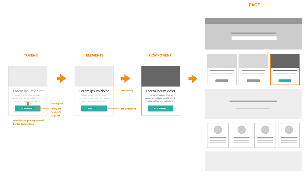
Inspired by Brad Frost's Atomic Design Principles we designed the system to be modular and scalable from the smallest unit (tokens) up to pages built using modular components.
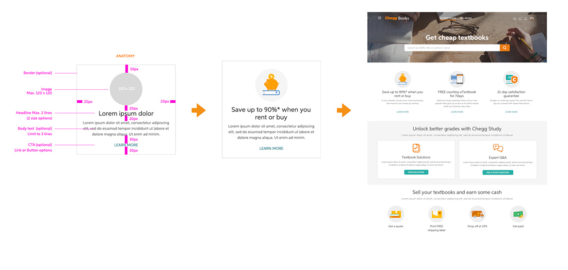
Modular components
We created a system of modular components that could be easily configured using an internal tool to create landing pages in a matter of hours instead of days.
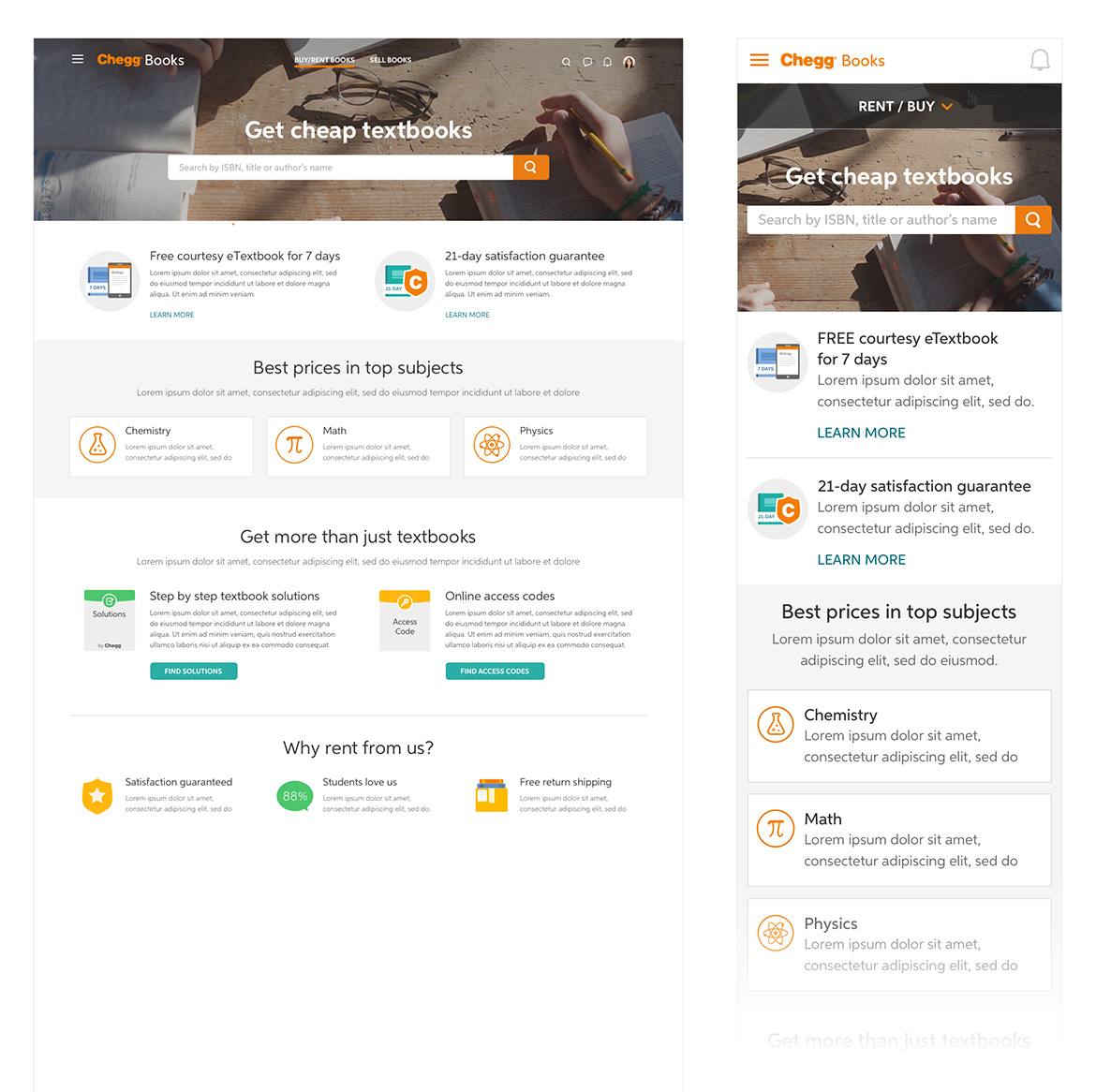
Responsive design
The system was designed responsively to create a more unified cross device experience.